
First off, an enormous thanks to Erin Fitzsimmons and Andrea Vandergrift, the designers who worked with me on creating this cover and who have been shepherding my artwork throughout the whole process of making this graphic novel. Everything is going to print so beautifully thanks to their expertise.
A number of things went into consideration as I was sketching out ideas for the TIDESONG cover, namely:
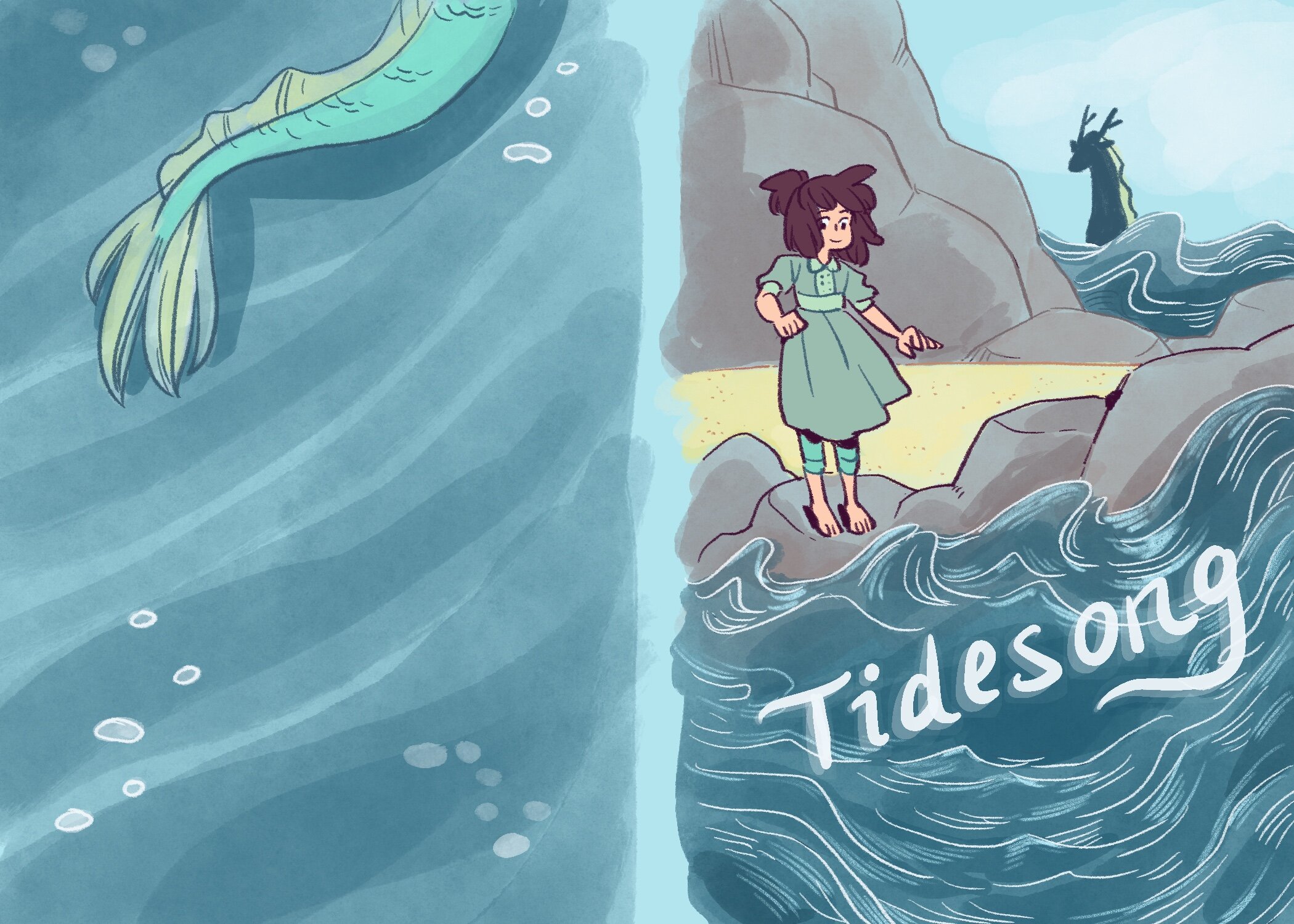
It should be bright, colorful and cheerful
It has to have kid appeal
The main character has to be featured
The main themes of the story should be visually implied— the ocean, for one, since the title of the book is literally TIDESONG! But also the text placement on the cover.
I definitely wanted the text to be wavy and tilted to mirror the effect of ocean waves
With that, I went into creating several colored sketches for the Harper design department and marketing to consider:
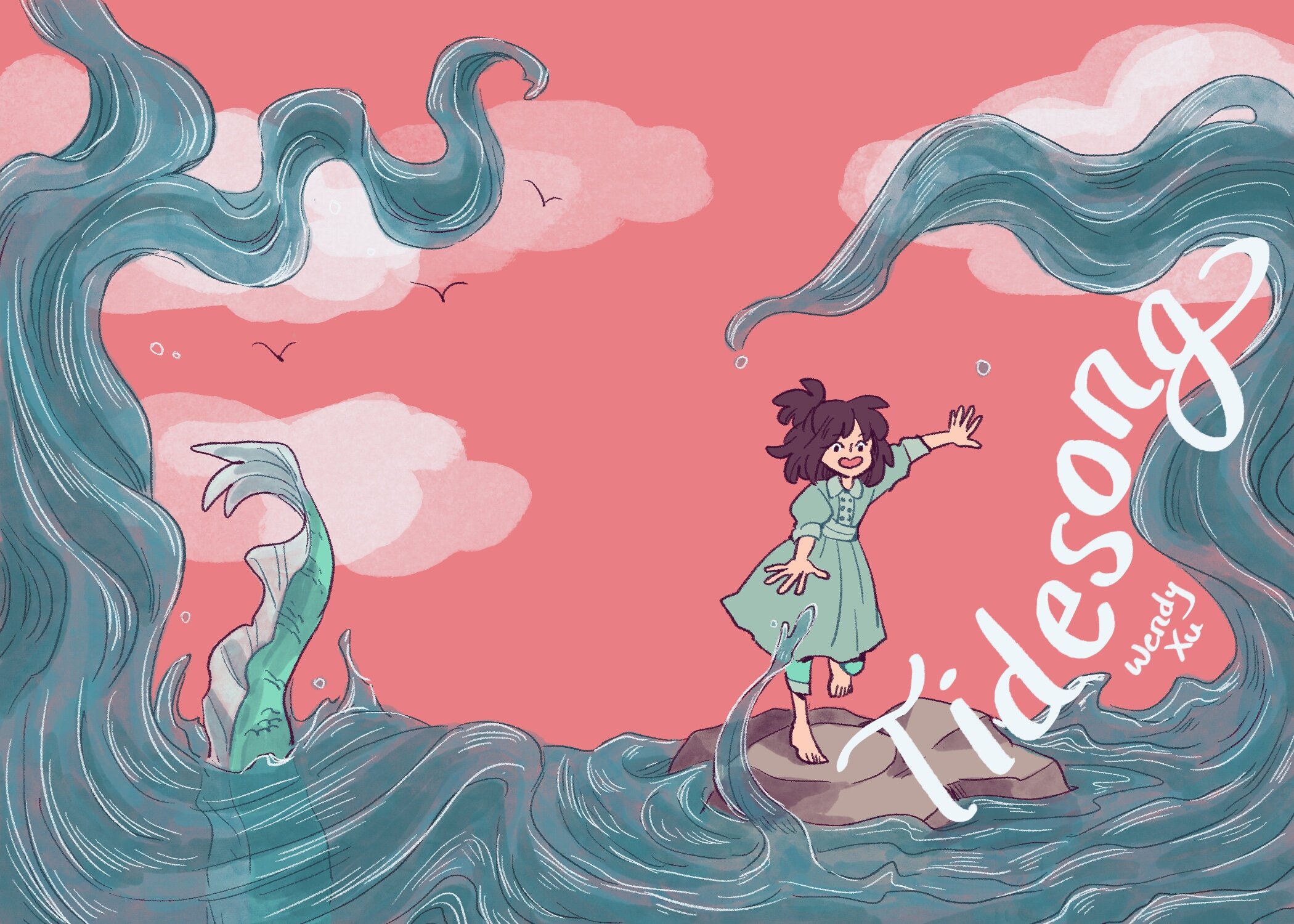
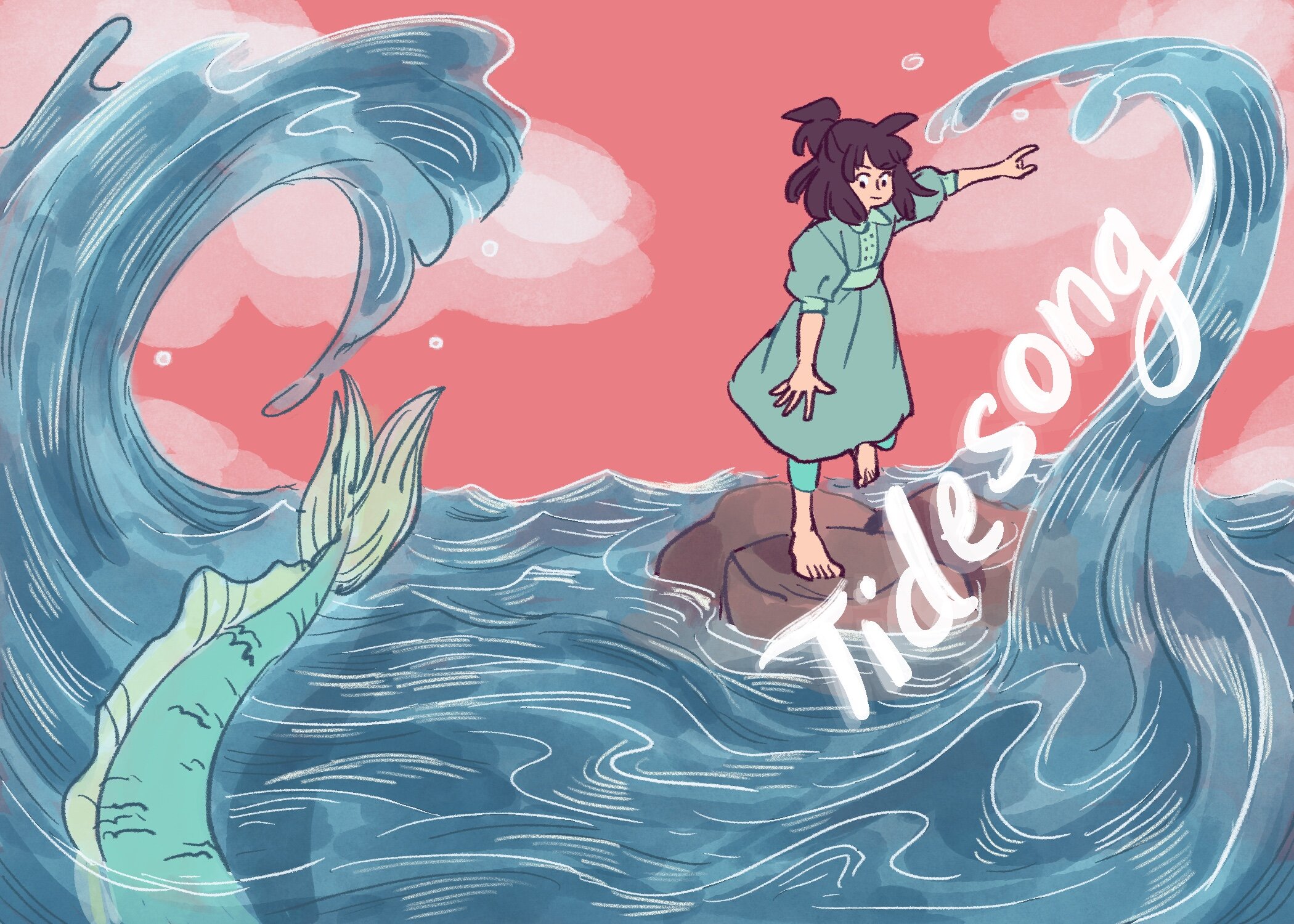
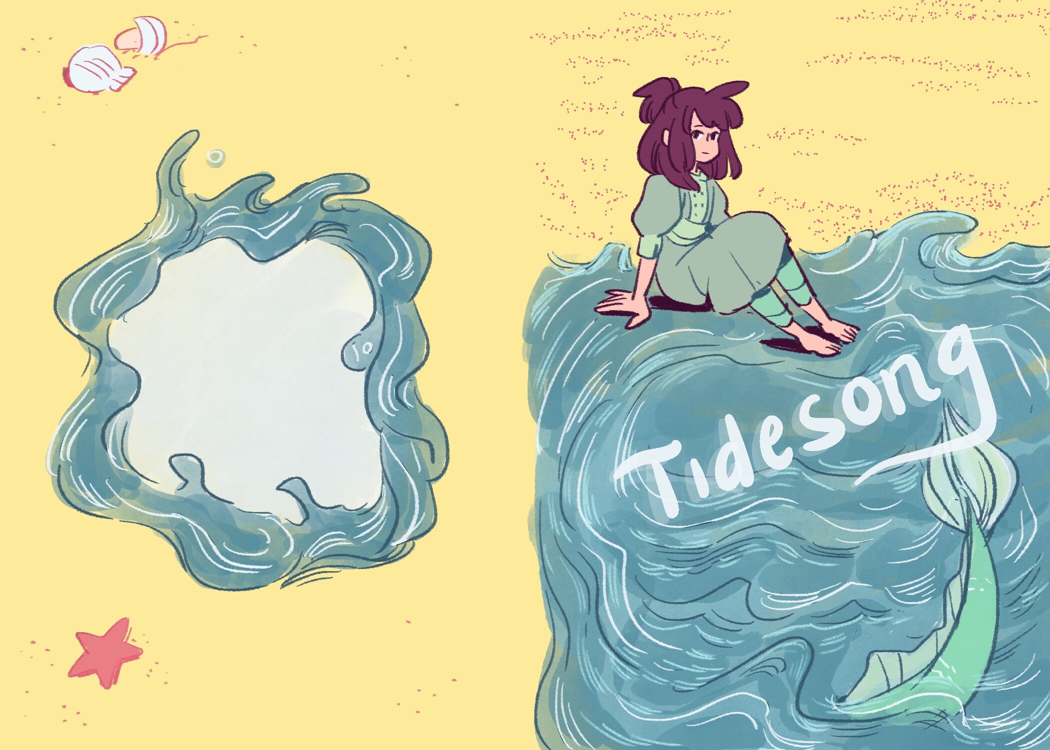
These sketches are a bit more detailed than what I would draw as a layout for a comic panel or page, because I really wanted to communicate as clearly as possible to everyone who would be appraising the sketches. The pink was my favorite, and I’m glad everyone agreed! So we then went to refining that pink cover and shifting a few things around, and ended up with this as the final idea for the cover and back cover.

So with this refined sketch approved, I went ahead to create the final front cover, which you can see below. The hand-drawn text treatment is by Erin, as I liked her lettering way more than mine! There’s a lovely waviness to her text that I could never quite approach in my attempts! My name is lettered by me though… for some reason, I couldn’t get the title placement lettering right but I got my name right.
And finally, the cover is complete! This is the CMYK version, in case you were wondering about the colors looking a bit funky compared to my sketches and time-lapse— my art program, Procreate, works best with RGB colors, so the design team converts my files to be print-worthy, and we had a chat when I first began creating the palette to make sure I was using colors that would print correctly!
